

For anyone who has ever ridden a roller coaster, the distinct sound of the chain nearing the top of the first drop echoes in our ears. Click, click, (slower) click…. Anticipation builds right before we experience the massive first drop, picking up speed on the way down. If only the equity markets provided the same clues. We often hear that, “This time is different.” Occasionally, a roller coaster DOES get stuck at the top, but it never stays there. We might be nearing the top once again. Will we stay here or plummet? Much like an amusement park ride, the market is meant to go up and down, but lately it is a one-way ticket. How can we tell if we should tighten our seat belt? The numbers give us a clue.
Why Look at Ratios Now?
Decades of market data give us comparison points to see where we might be in the cycle. Fed actions, government stimulus, and revolutionary technology like the growth of the internet, smartphones, or currently AI, affect how long these trends might last. Printing of dollars, leading to inflation, affects these numbers as well. That being said, the ratios point to an extreme picture of overvaluation. The saying goes, “The market can stay irrational longer than you can stay solvent.” So how irrational is it?
Classic P/E (Price to Earnings): Useful but Noisy
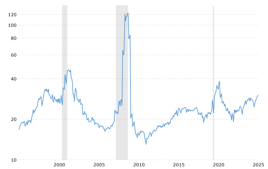
We first look at the price-to-earnings (P/E) ratio. This formula divides the price of the stock by the earnings per share (EPS). Currently, it stands at 30.15, which is 88% higher than its long-term average of 16. Looking at the chart below, we seem to be approaching a new near-term high, but we look well below the 2009 peak. Statistics do not always tell the story well. After all, in late 2008 and early 2009, we were in a deep recession. In that instance, earnings collapsed while stock prices fell, but less so, anticipating an eventual recovery. Therefore, the small denominator drove an inflated figure.
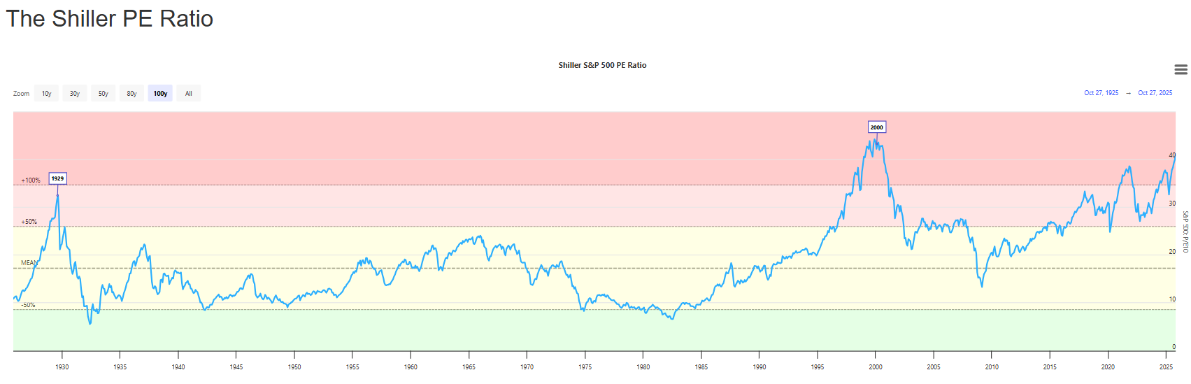
Shiller CAPE (10-Year, Inflation-Adjusted P/E): Smoothing the Noise
The Shiller PE ratio, also known as the Shiller CAPE ratio, aims to fix distortions like the one shown above by using 10-year average earnings adjusted for inflation. This levels EPS to avoid a spike in P/E ratios following even a small period of poor earnings. As seen from the 2008 period, losses could yield undefined or negative P/E ratios if contraction occurs. By accounting for changes in the value of a dollar in the Shiller formula, the picture remains consistent even in times of elevated inflation. Since it uses the S&P, the data set is over 100 years old. So, what does the current level tell us?
The current CAPE ratio is 37. This compares to a historical average of 17. It is in the top 2% historically, having only hit this number in 1929, 2000, and 2022. Recent periods have seen a much higher average than previous periods. I believe that the low-rate environment is a significant driver of this phenomenon.
Buffett Indicator (Total Market Cap / GDP): A Top-Down Alarm Bell
The so-called Buffett Indicator divides the total market capitalization of the US stock market (using the Wilshire 5000 index) by the US GDP. With a long-term average of 80% and a normal range between 80-120%, Buffet uses this as a guide to determine when to buy. His rationale is simple: the formula captures the entire economy in one metric, has a 50-year track record, and GDP is relatively smooth from period to period. The current ratio of 201% is an area he identifies as the “danger zone.” It is currently at its historical peak. He states from his 2025 shareholder letter, “We have never seen the ratio this detached from economic reality. At 200%+, future returns will be poor — but timing a top is impossible.” His actions back up this opinion with $130 billion in stock sales from 2023 to 2025 and no major acquisitions since 2016 for Berkshire Hathaway.
Critics suggest that a key flaw in this metric is that it only counts US GDP and that domestic companies sell extensively outside the United States. Low interest rates also push investors into equities, accelerating prices. Despite these criticisms, any reading at the 99.9th percentile of its range should be taken seriously. The Current Market Valuation site shows it even higher at 217% in the chart below.

“This Time Is Different”? The AI Productivity Argument
I spoke to an industry professional last week who echoed that “This time seems different.” He then began to laugh, because he knew the folly of that statement historically. He believes that the “AI Revolution” might fundamentally change how we work and reshape the economy. If companies can produce more with lower overhead from employee headcount while iterating faster than ever before, we could see rapid earnings growth. We see evidence of this already with profit margins of 11-13% in the past decade, compared to approximately half of that level from 1970 to 2000. Unlike the Dot.com boom, healthy balance sheets and profits support these valuations to a degree. Low interest rates and stock buybacks help prop up share prices as well.
Portfolio Posture: Seatbelts, Not Heroics
One should never eat a giant lunch before their roller coaster ride, and they should probably not add significant investment risk when the ratios tell us to be cautious. Going on the lazy river can still be fun before you take your next exhilarating ride, and diversifying your portfolio is still the best way to invest. Every asset class has its day, and some perform their best during stress. Time will tell where we are, but bubbles only become obvious after they pop. Click, click, click…
Photo by STANLEY METELSKI on Unsplash
Related Posts

Iran, Venezuela, and the New Global Oil Order
Recent events remind us that balance in energy markets can be delicate. A conflict in the Middle East and the removal of a sitting President in Venezuela resulted in sharp moves across the energy industry in early 2026. Currently, the Iran War is creating havoc in crude shipments, affecting the world. While trouble in that […]

Decoding Metals Price Action
Markets often communicate more clearly through price action than through headlines. The dramatic surge in metals contracts is sending a powerful signal, but what exactly is it telling us? Traders frequently monitor inter-market relationships for early warnings. When one asset class moves unusually, it can ripple across the system or reveal deeper structural issues. In […]
2025 in Review: Markets, Policy, and the Path Forward
History never repeats itself, but it often rhymes. This is even more so the case this year, as Trump began his second term with similar but different disruptions to the markets. Rising stocks, normalizing inflation, and the AI boom took center stage. We discuss some of the key events below and try to anticipate where […]