
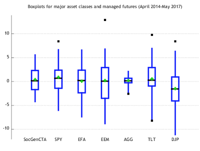
Investors are so used to looking at standard deviation to define risk that they forget some easy exploratory data analysis tools that can be very helpful. The boxplot focuses on a greater description of the data through a simple display of a brand array of information. The box is formed by the first and third quartiles, the whiskers are 1.5 times the interquartile range, the green diamond is the average, and the black boxes are the outliers.
We have looked at the last three years of monthly data and can make some simple observations. This list can be much larger. First, most asset classes are subject to some outliers and there is a lot of movement going on outside the box. Second, risks can vary greatly across asset classes even between US and international stocks. Third, there are significant differences in fixed income risks. The diversified lower duration Barclays Aggregate index is much less risky than holding the long bond. Finally, a portfolio of managed futures as a representative alternative asset class shows a much tighter distribution of returns. Portfolio risks may be more concentrated in the traditional assets. We are not making a case for managed futures, but rather highlight the richness of data that can be gleaned through simple tools beyond standard deviation.
This follows the old adage – before you model it, plot it. If you don’t have a feel for the data, it will never talk to you or guide you.